茨城県境町にある設計事務所ワカナデザインです。この度、境小学校の図書室に新たな読書スペースを持つ展示コーナーのデザインを担当させていただきました。子どもたちの読書環境を豊かにするためのアイデアから完成までの過程を、皆様にご紹介したいと思います。
The story leading up to the completion of the display corner in the Sakai Elementary School library, woven through the exchange with Noelani Elementary School.
このプロジェクトの目的
The purpose of this project
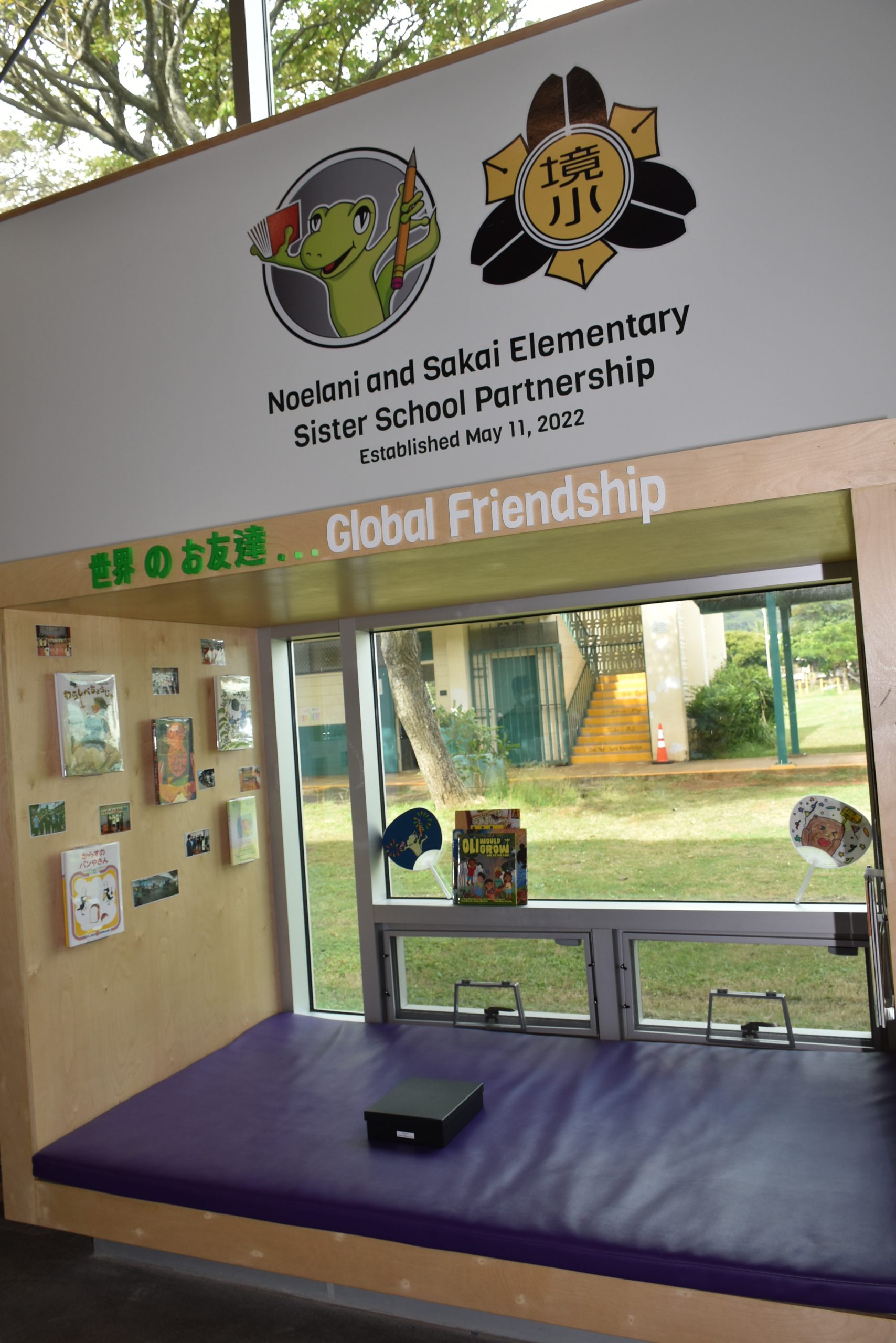
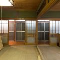
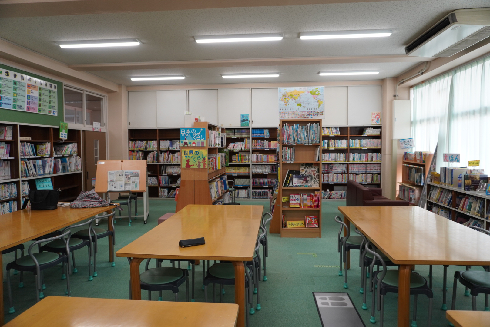
境小学校は、ハワイのノエラニ小学校との交流があります。このプロジェクトの目的は、ノエラニ小学校からの展示物や絵本を展示しながら、子供たちがワクワクして読書を楽しめる環境を作り出すことでした。こちらの写真は、すでに存在するノエラニ小学校の図書室の一角です。世界のお友達として、境小のコーナーが作られています。しかし、こちらを見ると外の環境もとても良くてうらやましいですね。それと校章を見ても遊び心があって楽しいですね。これは、こちらも負けないようアンサーしなければなりません。ということで気持ちが入りました。
Sakai Elementary School has an exchange with Noelani Elementary School in Hawaii. The purpose of this project was to create an environment where children can get excited and enjoy reading, by displaying exhibits and picture books from Noelani Elementary School. The attached photo is a corner of the existing library at Noelani Elementary School. As friends from around the world, a Sakai Elementary corner has been set up. However, looking at this, the external environment is also very appealing and enviable. Also, their school emblem has a playful and fun design. Seeing this, we feel compelled to respond in kind and step up our game. This really motivated us.
発想のきっかけ
The inspiration behind the idea
子供たちは狭い場所が好きです。実は、大人もそうかもしれません。程よい狭さが興奮や期待感を増大させると私は感じています。日常での図書館や本屋さんを訪れる際、こんなコーナーがあれば子供たちはもっとテンションが上がるのではないかと思っていました。その考えを基に、今回のプロジェクトにはその思いを込めました。
Children seem to love cozy spaces. In fact, adults might feel the same way. I believe that a certain level of compactness can heighten excitement and anticipation. When visiting libraries or bookstores in our daily lives, I thought that having such a corner might elevate the children’s enthusiasm even more. With that thought in mind, I poured my heart into this project.
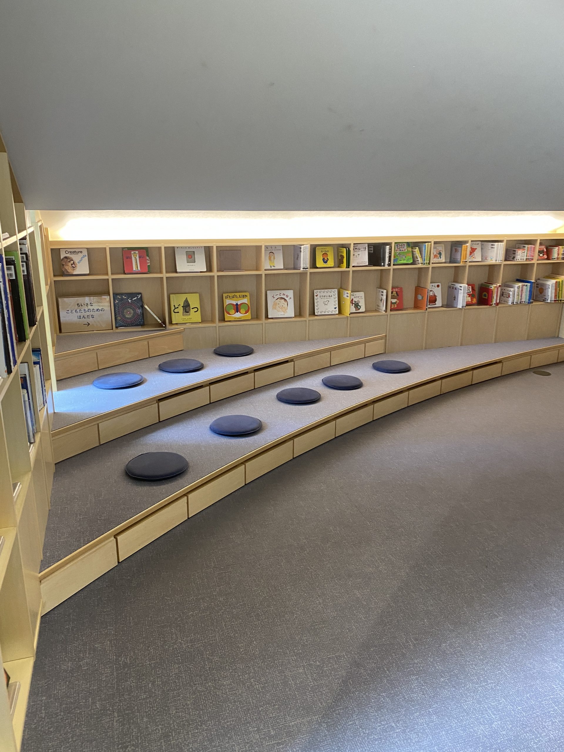
こちらは大阪にある「こども本の森 中の島」、安藤忠雄氏の作品です。奥に進むにつれて天井が低くなり、自然とその方向へ誘導される設計となっています。実は、この場所を訪れた時、すでに図書室の工事は始まっていました。しかし、この体験を通じて改めて実感しました。天井が低い空間は、確かにワクワク感を持たせるものがあると。
This is ‘Kodomo Hon no Mori Nakanoshima’ located in Osaka, a work by Tadao Ando. As you move deeper into the space, the ceiling gets lower, naturally guiding visitors in that direction. In fact, when I visited this place, construction of the library had already begun. However, through this experience, I was reminded once again. Spaces with low ceilings indeed evoke a sense of excitement.
アイデアを形にする
Bringing an idea to life
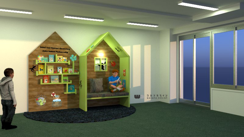
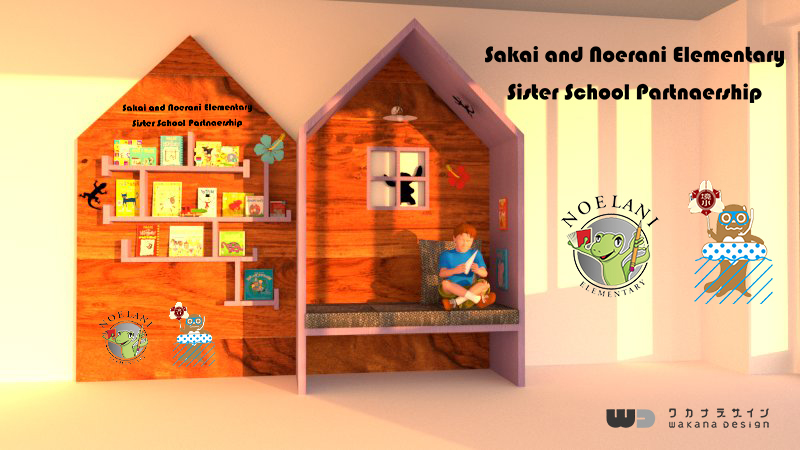
さまざまなインスピレーションを受けて、それをパースで具体的な形にしました。ハワイというテーマを意識し、特徴的な日本のモノトーンデザインは避け、最初から鮮やかな色合いを選びました。特に紫と蛍光に近いグリーンを取り入れました。デザイン面においても、従来の枠にとらわれず、境小の校章を単純に使用するのではなく、境町のマスコットキャラクター「さかいたち」を取り入れることにしました。海を連想させるデザインにし、以前から存在するさまざまなポーズの「さかいたち」のデータを6、7年前のものから探し出しました。ダメだと言われてもやめるだけだと考え、思い切って多彩な要素を盛り込みました。
Inspired by various influences, I visualized them into concrete forms using perspective drawings. Being conscious of the Hawaiian theme, I decided to avoid the distinctive Japanese monochrome design and chose vibrant colors from the outset. In particular, I incorporated shades of purple and a green close to fluorescent. In terms of design, instead of being confined to traditional boundaries or merely using the Sakai Elementary’s emblem, I opted to incorporate the Sakai town’s mascot character ‘Sakaitachi’. I aimed for a design that evokes the sea and dug out data of ‘Sakaitachi’ in various poses from 6-7 years ago. I figured that the worst-case scenario would be being told it’s not good enough, so I boldly incorporated a variety of elements.
その反応は?
What was the reaction?
その反応は、意外とOKでした。自由な発想で進めていたので、その点については非常に嬉しかったです。同時に、このパースのイメージをできるだけ現実のものに忠実に再現しなければと感じました。パースと現場の完成形が大きく異なると、せっかくの許可が無意味になってしまうからです。そういった点を注意深く考慮しながら、工事が始まりました。
The reaction was surprisingly positive. As I had proceeded with a free-spirited approach, I was very pleased about that aspect. At the same time, I felt the need to reproduce the image from the perspective drawings as faithfully as possible in reality. If the finished product on-site differed greatly from the perspective, the hard-earned approval would be rendered meaningless. With such considerations in mind, the construction began.
いざ施工スタート
Time to kick off the construction!
上の写真は、施工前の様子です。一番奥の壁面の真ん中に、はめ込む形で設置する予定です。
The photo above shows the situation before construction. We plan to install it in the center of the wall at the farthest end, fitting it in place.
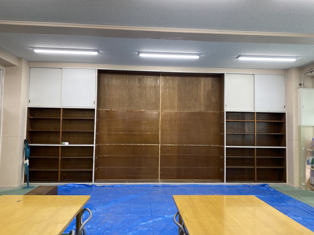
真ん中を大きくくり抜く予定でしたが、予想外の事態が発生しました。背面のベニヤを活用するつもりでしたが、実際に触ってみると、その表面はべこべことしていました。これは困った、と思い施工者さんとの相談の結果、このベニヤは下地として使用するのは不適切と判断し、取り除くことになりました。この部分だけをきれいに切り抜く作業が求められました。使用されていたベニヤは古く、壊れやすい状態でした。リフォームやリノベーションでは、予期せぬ問題が生じることがよくあります。
We originally planned to cut out a large portion in the center, but an unexpected situation arose. We intended to utilize the veneer on the back, but upon touching it, we found its surface to be uneven and bumpy. Thinking ‘This is a problem,’ we consulted with the contractor. As a result, we deemed this veneer inappropriate for use as a base and decided to remove it. We were required to neatly cut out just this portion. The veneer that had been used was old and easily breakable. In renovations and remodels, unforeseen issues often arise.
壁面にはコンクリートの原面が露出しました。ベニヤをはがした結果、次にどのように対処すべきか考える必要が出てきました。結果として、施工者さんには申し訳なかったのですが、白ペンキで塗装していただくこととなりました。昔のコンクリートの荒々しい質感は、実はとても魅力的で、私たちもその風合いを気に入っていました。そして、小屋の建設が進行し、図面よりも実際のものが大きく感じられました。それに伴い、その重量もあり、大工さんも設置するのに一苦労していました。このような現場の困難を目の当たりにすることは、設計者として非常に貴重な経験となります。
The raw surface of the concrete was exposed on the wall. After removing the veneer, we had to decide how to proceed next. Ultimately, and with apologies to the contractor, we decided to have it painted with white paint. The rugged texture of the old concrete was, in fact, very appealing, and we really liked its character. As the construction of the hut progressed, it felt bigger than what was illustrated in the blueprints. Correspondingly, it had considerable weight, and the carpenters struggled with its installation. Witnessing such on-site challenges firsthand is an invaluable experience for a designer.
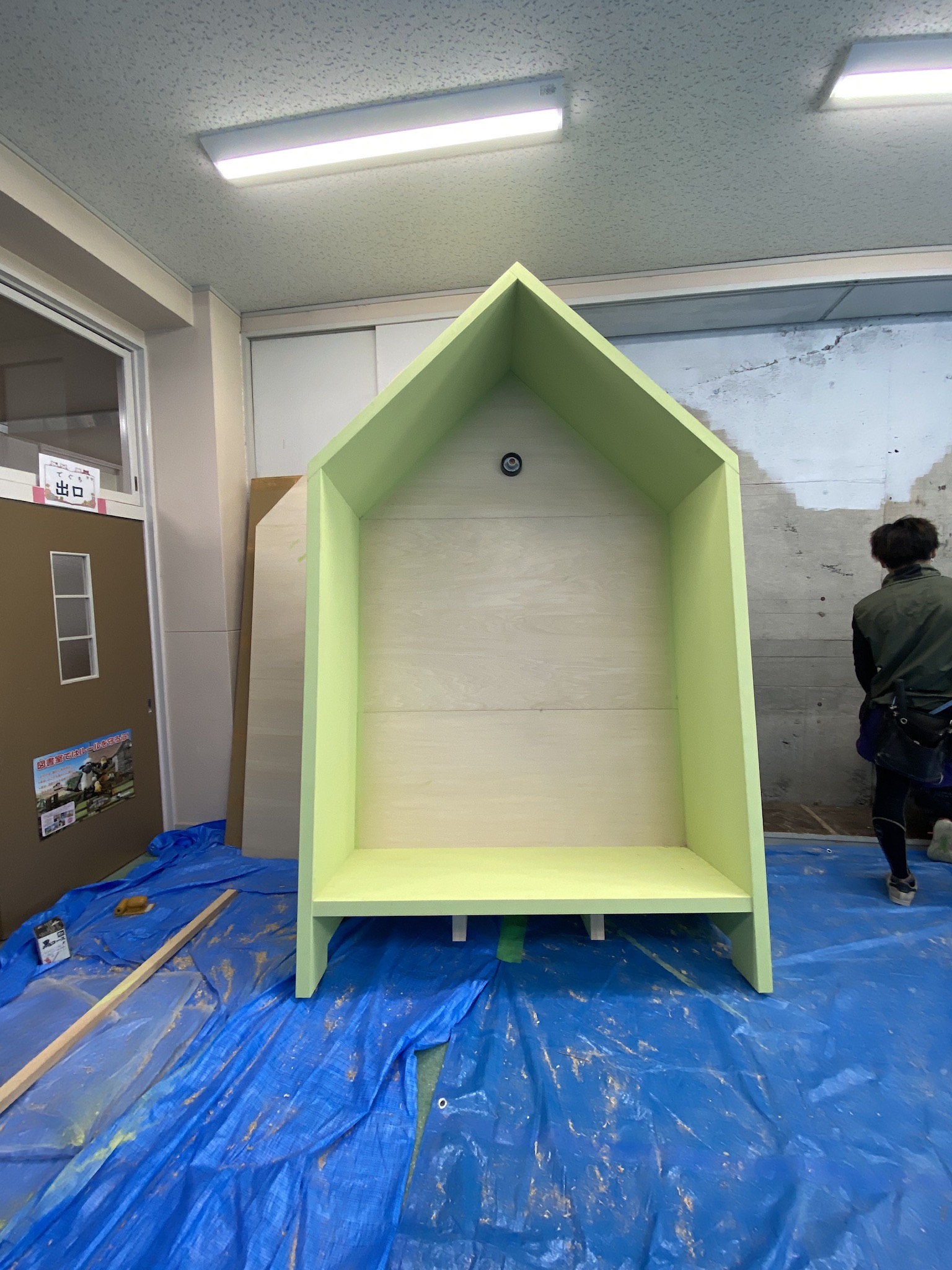
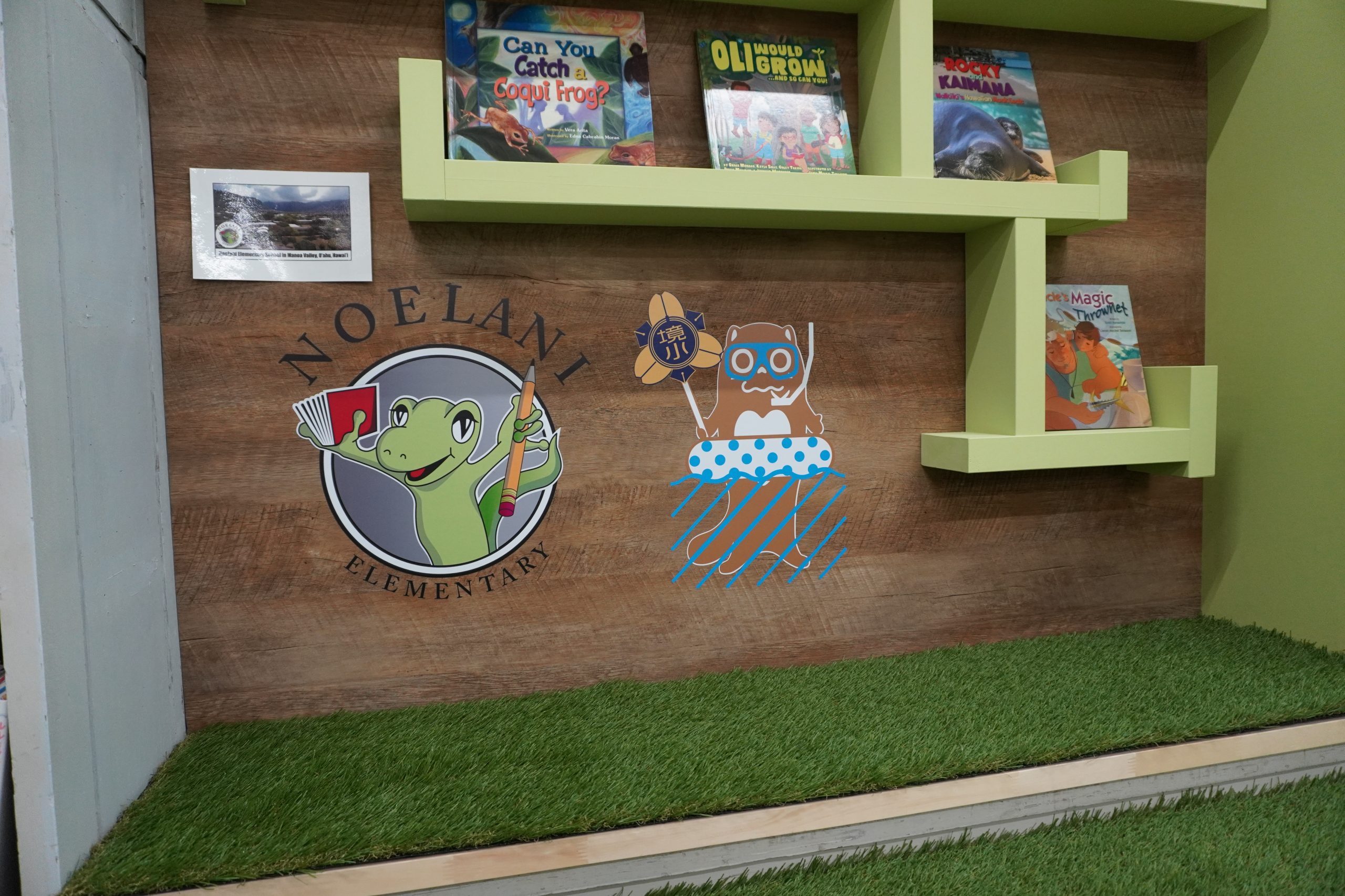
実際、この工事の完成期限は非常にタイトでした。解体からわずか1週間後には完成させる必要がありました。そのため、塗装作業もほぼ同時に進行しました。色の選択にあたっては紫とグリーンの二択でしたが、何人かの子供たちに意見を求めたところ、グリーンが選ばれました。ノエラニ小のキャラクター、『やもり』がグリーンであったことから、私自身もグリーンの方が適していると感じていました。やもりの色に近いグリーンのペンキを選ぶために探し回りました。このペンキには少し高価なものを選択しました。その特有の雰囲気を出すにはこの品質が必要だと判断し、コスト面でも優先させました。このシリーズのペンキはどれを使用してもおしゃれになるのでお勧めです。
In reality, the completion deadline for this construction was extremely tight. We had to finish just one week after demolition began. As a result, painting work progressed almost simultaneously. When it came to choosing colors, it was a choice between purple and green. After seeking opinions from several children, green was chosen. Given that the character from Noelani Elementary, “Yamori,” was green, I personally felt that green was more appropriate. I searched extensively to select a paint color close to the hue of Yamori. We opted for a slightly more expensive paint. We judged that its quality was necessary to achieve the desired ambiance, and it was given priority even in terms of cost. I recommend any paint from this series, as it lends a stylish touch to any space.
大工さんは、本棚の複雑な形状も丁寧に制作してくれました。そして、隣のグリーンの色を確認した際、パースと比べてやや薄く感じたため、追加で一度塗り重ねてもらいました。一度の塗りだけでは、下地の色が透けて白く見えることがあったからです。この時期には、カッティングシートとクッションの製作も並行して行われていました。様々なタスクが同時進行で進められていたので、大変な時期でしたが、それぞれの項目をきちんとクリアしていくことができました。
The carpenters meticulously crafted the complex shape of the bookshelf for us. When checking the green color next to it, it felt somewhat lighter compared to the perspective drawing, so we had them apply an additional coat. With just one layer of paint, the base color sometimes showed through, making it look white. During this period, the production of the cutting sheet and cushions was also underway simultaneously. Numerous tasks were being carried out at the same time, making it a hectic period, but we managed to successfully complete each item.
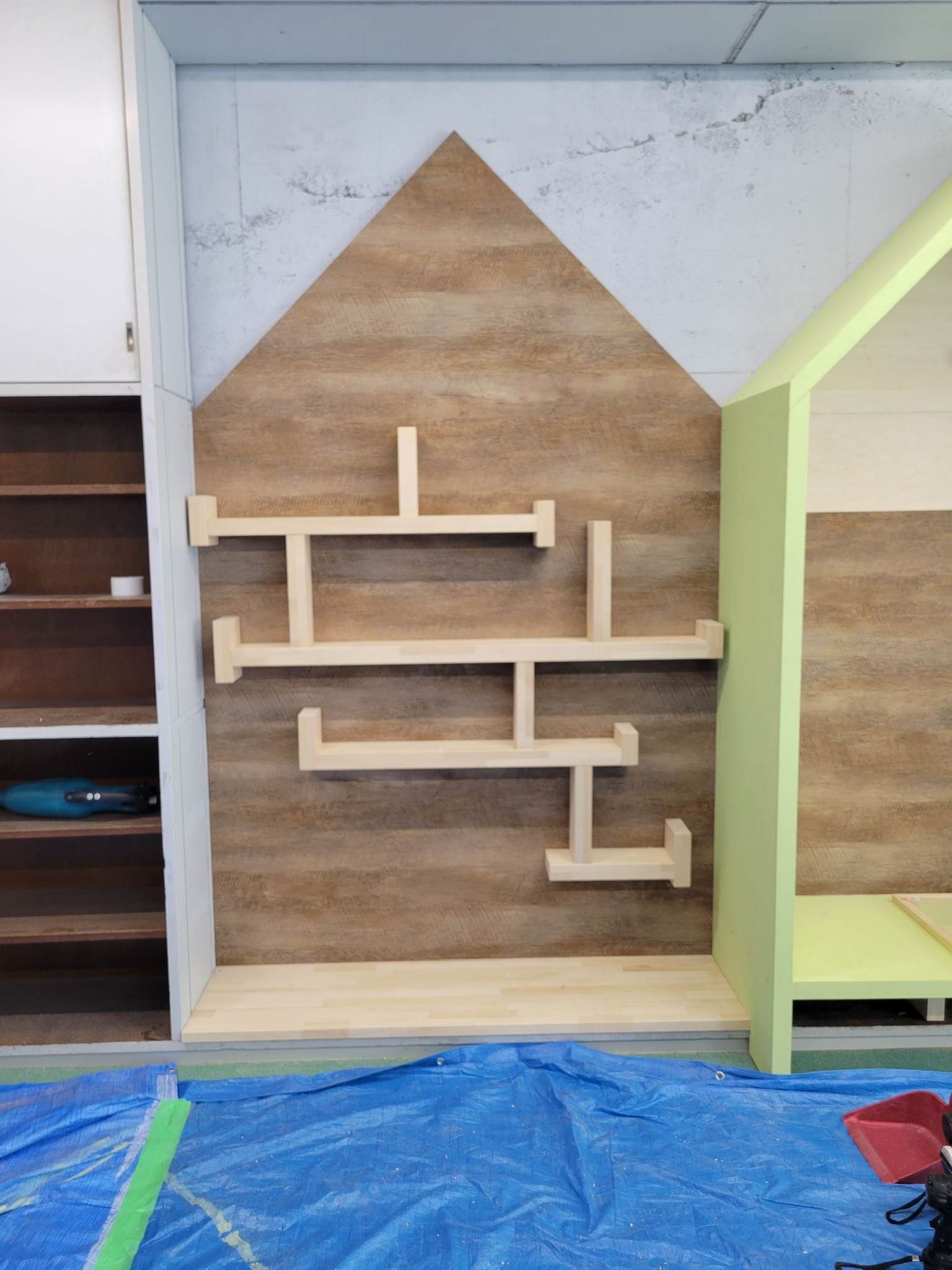
進行が急ピッチとなりました。初めに、シナベニアの素地にダイノックシートの貼り付けが完了しました。この高級な木目のシートを採用しないと、全体のイメージが落ちると感じました。実際に見てみると、本物の木目よりも自然で造作なく、その質感の良さが伝わってきました。次に照明器具の設置が行われました。使用したのは、通販で人気のTOOLBOXブランドのLED電球です。電球カバーの中には実際の電球が内蔵されていて、私はクリアなガラスを選択しましたが、曇りガラスも選べたので、その選択も良かったかと思い返すこともありました。さらに、クッションの製作も進められましたが、その幅が1600mmもあるため特注が必要でした。時間の制約もあり、信頼できる方にお願いしました。まさに、多くの部分が手作りの精神で進められました。生地は私が直接選んで購入し、中の低反発ウレタンもオンラインで取り寄せました。ウレタンは価格が高めでしたが、届いた商品の質には納得できました。その結果、クッションも無事に完成しました。
失敗談もあります。。。
床の人工芝についても奇麗に丸くカットされていました。ここだけ特別空間になっているでしょうか。 ここからは、細部の調整作業が主となります。このように本が並べられると、一気に現実感が増します。子供たちが喜んでくれるだろうかと、その視点で様子を眺めました。
このように、提供していただいたカッティングシールを一緒に貼っていきました。非常に質の良いシールでした。しかし、現場での作業はトラブルもあるものです。実際、このシールは一度剥がれてしまいました。貼る際に素地がはがれやすい印象を受けていたのですが、その懸念は現実となってしまいました。しかし、修正は十分可能で、スプレー糊を使って問題を解決していただきました。
又、私が英語のスペルを間違えていたことも途中で発覚!教育委員会さんの指摘により発注前でしたので助かりました。あぶなかった!
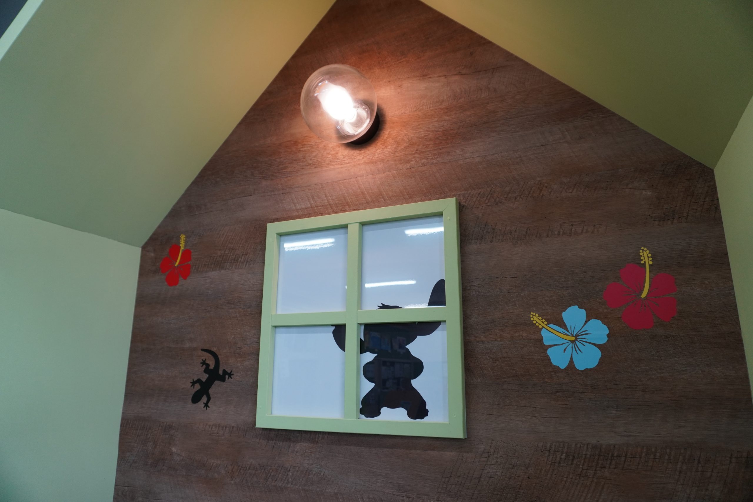
トカゲやキャラクターがシルエットでランダムに登場します。実際座ってみてここにあったらおもしろいね、とか、相談しながら施工者さんと一緒に進めました。
ノエラニ小学校の自由さに境小学校も負けてないでしょうか?喜んでくれるかな?とそればかり考えながら。
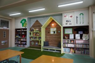
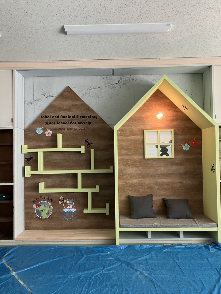
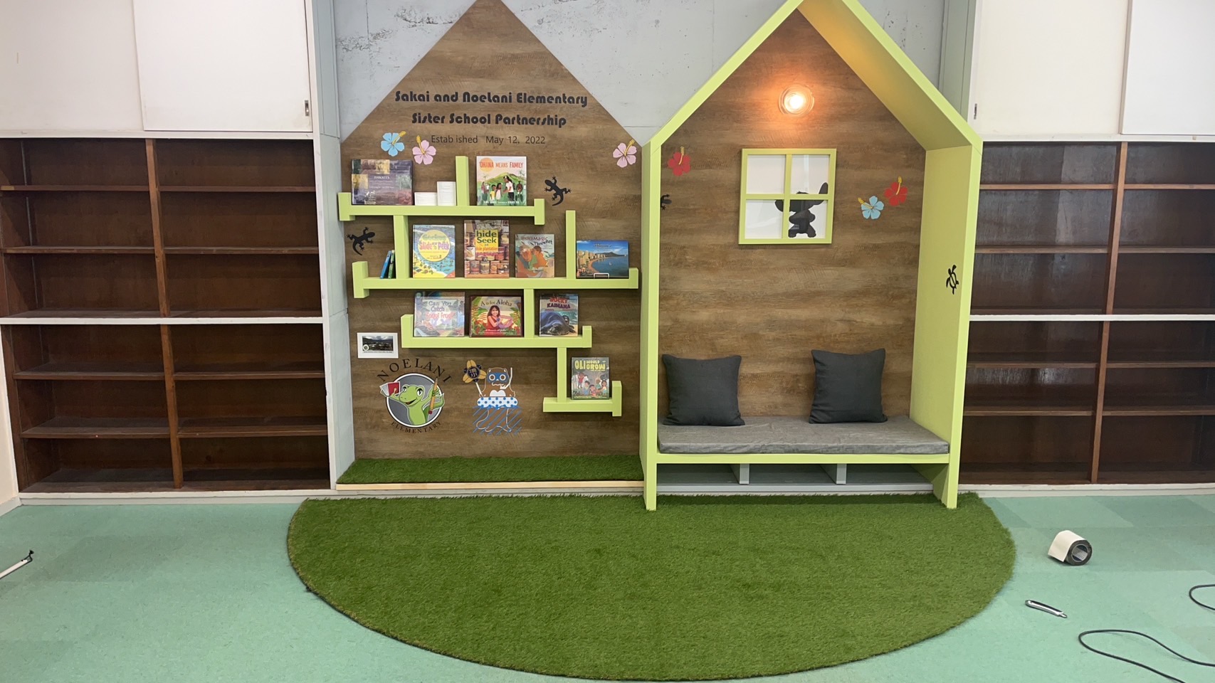
無事完成です!
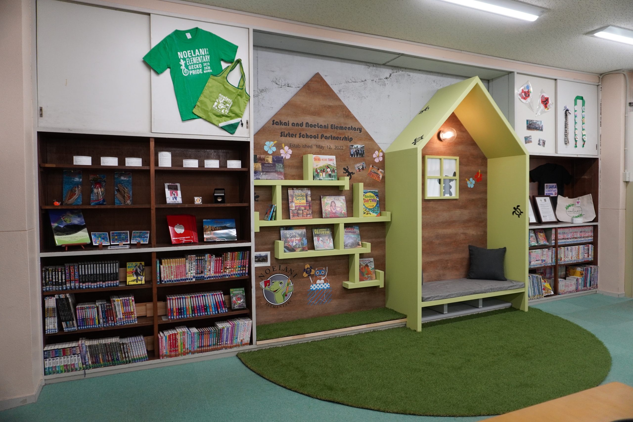
完成しました!本棚とその周囲には、学校側でディスプレイを施してくれたおかげで、ハワイのノエラニ小学校との交流の様子がここでよく分かるようになっています。私がこの後の現場を直接見ることはできなかったため、実際に子供たちがどのようなリアクションで接してくれたのかは未知数ですが、全力で取り組んだので、否定的な意見を耳にするとショックを受けるでしょう(笑)。
このたび、境小学校の図書室の展示コーナーのデザインを担当させていただき、初めに町長や校長先生からお話を伺う機会が持てたのは、プロジェクトへの理解を深める上で非常に助かりました。私自身も久しぶりにワクワクするようなプロジェクトに関わることができ、とても感謝しています。子供向けの施設は、やはり楽しいと改めて実感しました。関係者の皆様、誠にありがとうございました。
こんにちは、一級建築士の鈴木祐子です。株式会社WakanaDesign一級建築士事務所の代表を務めております。茨城県境町に拠点を置き、建築設計のプロフェッショナルとして21年目に突入いたしました。真剣さと遊び心の絶妙なバランスを大切にし、魅力的な空間をデザインしています。
—————————————-
↓HPはこちら↓
https://wakanadesign.com/
↓BLOGはこちら↓
https://wakanadesign.net/
株式会社WakanaDesign一級建築士事務所(ワカナデザイン)
🏡茨城県猿島郡境町下小橋555-13
—————————————-
Q.どんな設計事務所?
A.茨城県境町に拠点を置き、建築設計のプロフェッショナルとして21年目に突入いたしました。真剣さと遊び心の絶妙なバランスを大切にし、魅力的な空間をデザインしています。
Q.なにが専門の設計事務所?
A.私たちは小規模でありながらも、リノベーションに特化した設計事務所です。お客様のニーズに合わせた柔軟な対応が可能であり、小回りの利くサービスを提供しています。リノベーションプロジェクトにおいては、建物の魅力を最大限に引き出し、新たな価値を創造することに注力しています。
Q.設計の特徴は?
A.色使いや植栽にこだわり、ワクワク感を大切にした建築デザインを提供しています。建物が利益を生むことを追求しながらも、心地よい空間を創造することにも力を注いでいます。
Q.実績は?
A.これまでの実績には、パン屋さんやシェアオフィス、カフェ、アンテナショップ、食堂、保育園、学童保育、公園、ドッグランなどがあります。茨城県境町や埼玉県春日部市などで実際に見学可能な案件もございますので、ぜひ足を運んでみてください。
Q.仕事のスタイルは?
A.個々のプロジェクトに真摯に向き合い、企画設計から監理まで丁寧に取り組んでいます。建築が持つ力を最大限に引き出し、お客様のニーズに応えることを大切にしています。